Contact Form Best Practices: 15 Proven Rules for 2026
In short:
- Contact form best practices come down to three goals: make the form easy to finish, make sure every message reaches you, and reply quickly.
- Design: few fields, real labels, clear errors, a descriptive button and a form that works on phones and with a keyboard.
- Delivery: send from your own domain through SMTP, save every entry in WordPress, and stop spam without a puzzle.
- Follow-up: an instant auto-reply, a promised reply time you keep, and a timer that shows how long each message has waited.
- FillKite builds most of these contact form best practices in, so you can focus on the words and the replies.
Contact form best practices are usually presented as a list of design tips. Design matters, but it is only a third of the job. A beautiful form that loses messages to spam folders, or leads that wait three days for a reply, still fails. The best contact forms get three things right: they are easy to finish, every message arrives, and every message is answered.
This guide gathers 15 proven rules across all three, with links to deeper guides on each topic. Use it as a checklist for your own contact page.
Why contact form best practices matter
Contact form best practices exist because, for many businesses, the contact form is the main way new customers get in touch. It sits at the very end of your marketing: every ad, post and search result leads, eventually, to someone deciding whether to write to you. Weak contact form best practices waste all the effort that brought the visitor there. A form that is hard to fill in, emails that vanish, or replies that take days quietly turn interested people into lost ones, and you never find out how many.
The good news is that most fixes are small. Following contact form best practices rarely means a redesign; it means removing a few fields, fixing email delivery and answering faster.
Contact form best practices, part 1: make the form easy to finish
1. Ask for as little as possible
Name, email and message are enough for most contact forms. Every extra field is a reason to stop. If you need more from some visitors only, such as an order number for support, show it with conditional logic. See our guide to form abandonment.
2. Use real labels above fields
Labels above fields stay visible while people type; placeholder text inside a field disappears. Real labels are also what screen readers read, as the W3C’s form tutorials explain, which makes them one of the essential contact form best practices for accessibility.
3. Offer a topic choice when it helps
A short dropdown, such as Sales, Support or Something else, helps you route messages and reply faster. Keep it to a handful of options, and do not make it required unless you truly need it.
4. Write a descriptive button
“Send message” or “Ask a question” beats “Submit”. The button is the last thing people read before deciding; let it say what happens.
5. Show errors next to the field, in words
“Enter an email address like [email protected]” next to the email field helps; a red border alone does not. Keep what people typed when showing errors. Our guide to form error messages has examples.
6. Make it work on phones and with a keyboard
Most contact form best practices matter even more on a phone, where every extra field and every unclear error is harder to deal with.
Fields should be full width on small screens, use the right keyboards for email and phone, and be reachable with the Tab key with a visible focus outline. Our guide to accessible forms covers the details.
Contact form best practices, part 2: make sure every message arrives
7. Send from your own domain
Notifications should come from a real mailbox on your domain, not wordpress@ or the visitor’s address. Put the visitor’s address in Reply-To so you can answer with one click.
8. Use SMTP and authenticate your domain
Send through your mail provider’s server with SPF, DKIM and DMARC in place. It is the single biggest fix for contact forms whose emails land in spam. See our guides to WordPress SMTP and SPF DKIM DMARC.
9. Save every entry in WordPress
Email is not a database. Keep a copy of every message on your site, so a failed email never loses a lead. FillKite saves each entry before any email is sent and retries failed notifications. Our guide to WordPress form entries explains why this matters.
10. Stop spam without a puzzle
A hidden honeypot and a time check stop most bots with nothing for visitors to do. Add a spam score and a rate limit next, and a captcha only if needed. Our guide to WordPress form spam covers the order.
Contact form best practices, part 3: answer every message quickly
11. Send an instant auto-reply
Confirm the message arrived, say when they will hear back, and offer one useful link. Keep it short and never repeat the visitor’s whole message. Our auto reply email template examples help.
12. Promise a reply time, and keep it
“We reply within two working hours” next to the form and in the auto-reply reassures people. Then keep the promise; a reply reminder helps.
13. Route messages to one owner
Use the topic to send each message to the right person, rather than to a shared inbox where everyone assumes someone else will answer.
14. Watch how long messages wait
A reply timer on each entry, amber after an hour and red after a day, makes slow replies impossible to miss. Our guide to lead response time explains why minutes matter.
15. Offer another way to reach you
Some people prefer email or phone, and some cannot use a form at all. Show an email address and, if you take calls, a phone number next to the form.
Around the form: contact page best practices
The page around a contact form matters as much as the form itself. A few elements make visitors more willing to write:
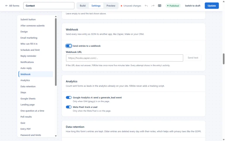
- A human heading: “Talk to a human” or “Ask us anything” feels more inviting than “Contact”.
- Who replies and when: a name or team and a reply time.
- Other ways to reach you: email, phone and, where relevant, an address with opening hours.
- Answers to common questions: links to help pages for people who can solve their own problem.
- Trust: a short testimonial or a sentence about how you handle personal data.
These additions do not lengthen the form, but they remove the doubts that stop people starting it. They belong on any list of contact form best practices, even though they sit outside the form.
Contact form best practices for different businesses
| Business | Keep | Add only if needed |
|---|---|---|
| Local service (plumber, cleaner) | Name, phone or email, what you need, postcode | Photos of the job |
| Agency or consultant | Name, email, company, message | Budget range, timeline |
| Online shop | Name, email, order number (for support), message | Topic dropdown |
| Software product | Name, work email, message | Company size, current tool |
| Clinic or professional service | Name, email or phone, reason for contact | Preferred time to call back |
The same contact form best practices apply everywhere; only the one or two extra questions change. If you need several of the “add only if needed” items, you probably need a quote form instead of a contact form.
Words that help
Small pieces of copy do a lot of work on a contact form. A line above the form sets expectations: “Tell us a little about what you need, and we will reply within two hours.” Hints under fields prevent errors: “We only call if you ask us to.” A short note beside the button removes a last worry: “We never share your details.” None of these add a field, and all of them make people more comfortable sending.
Audit your form in 15 minutes
You can check your own form against these contact form best practices in a quarter of an hour:
- Count the fields. Could any go? Could any become optional?
- Fill it in on your phone using mobile data. Note every moment of friction.
- Leave a field empty and send. Is the error clear and next to the field?
- Send a real message to a Gmail address as the visitor. Did the auto-reply arrive in the inbox, not spam?
- Check where your copy went. Is the entry saved in WordPress? Did the notification reach the right person?
- Time your reply. How long would a real customer have waited?
Write down what you find and fix the biggest problem first, usually email delivery or the number of fields. Repeat the audit every few months, because forms and email settings change over time.
Contact form best practices for teams
When several people handle messages, add two practices to the list. Agree who owns each topic, and match notification rules to it. And make replies visible: mark each entry as replied, add a short note, and let the inbox show everyone what has been done. Without these, even a perfect form produces duplicate replies or none at all.
Contact form best practices at a glance
| Goal | Practice | How FillKite helps |
|---|---|---|
| Easy to finish | Few fields, labels, clear errors | Real labels, inline errors, accessibility checks |
| Easy to finish | Mobile and keyboard friendly | Stacking fields, focus outlines, right input types |
| Every message arrives | Own domain, SMTP, DNS records | Built-in SMTP and a sender domain check |
| Every message arrives | Saved entries, no spam | Inbox, retries, honeypot, spam score |
| Every message answered | Auto-reply and a promise | Auto-reply with merge tags |
| Every message answered | Routing and timing | Notification rules, reply timer, reminders |
A good contact form, described
Picture a small design studio’s contact page that follows these contact form best practices. The heading says “Tell us about your project”. Under it, one line: “We reply within two working hours, Monday to Friday.” The form asks for a name, an email, a topic (New project, Existing client, Something else) and a message. A budget field appears only when “New project” is chosen. The button says “Send my message”. Beside the form, the studio’s email address and phone number, and a short quote from a client.
When the visitor sends it, the entry is saved, a short auto-reply confirms it, and a notification goes to the person who handles new projects. A reply timer on the entry turns amber if nobody answers within an hour. Nothing about this is complicated, and every piece exists to make sure an interested visitor becomes a conversation.
Contact form myths
- “More fields give better leads.” They give fewer leads. Qualify in your reply, or use conditional follow-up questions.
- “Every form needs a captcha.” Most spam is stopped by invisible layers; captchas cost real messages.
- “An email address on the page invites spam.” Some, but hiding it loses people who prefer email. Good mail filtering handles the rest.
- “The auto-reply is enough.” It confirms the message; it does not answer it. The real reply still has to come quickly.
Match the tone to your brand
The words on your form should sound like you. A law firm and a surf school should not have identical contact pages. Keep the practical elements the same, such as clear labels, a reply time and another way to reach you, and let the heading, the intro line and the success message carry your personality. Visitors notice when a form feels like it came from the same people as the rest of the site, and it makes writing to you feel more natural.
Privacy by default
Collect only what you use, explain why near the form, link to your privacy policy, and delete old entries on a schedule. If you add a newsletter box, keep it optional and unticked. These contact form best practices protect visitors and your business alike; our guide to the GDPR contact form has the details.
Where to start if you only have an hour
If you cannot do everything today, pick the contact form best practices with the biggest effect first. In most cases that order is: make sure messages arrive, by fixing the sender address and SMTP; make sure every entry is saved; cut the form down to the fields you actually use; add an auto-reply with a reply time; and turn on a reply reminder. Those five changes take about an hour with FillKite and solve the problems that cost small businesses the most leads. Design polish can come later, once nothing is being lost.
Revisit the full list of contact form best practices once a quarter, because forms grow new fields, team members change and email settings drift. A short, regular review keeps a good form good.
Measure and improve
Watch how many visitors who see the form send it, and how quickly you reply. FillKite’s forms list shows each form’s views and conversion rate for the last 30 days, and the inbox shows your average first-reply time. Improve one thing at a time, and check the numbers again after a few weeks. Our guide to form conversion rate explains the testing method.
A contact form best practices checklist
- Three to five fields, with real labels above them.
- A descriptive button and clear, inline errors.
- Works on phones and with a keyboard.
- Emails sent from your domain through SMTP, with SPF, DKIM and DMARC.
- Every entry saved in WordPress.
- Invisible spam protection, captcha only if needed.
- An instant auto-reply and a reply-time promise you keep.
- Messages routed to one owner, with a reply timer.
- Another way to reach you shown next to the form.
Where contact forms go wrong
| Mistake | Effect | Fix |
|---|---|---|
| Ten fields for a simple question | People leave | Name, email, message |
| Emails from wordpress@ | Messages in spam | Own domain, SMTP |
| No saved copy | Lost leads when email fails | Save every entry |
| Puzzle captcha | Fewer real messages | Invisible protection first |
| No reply-time promise | Visitors contact competitors too | Promise and keep it |
| Shared inbox for everything | Nobody replies | One owner per topic |
Frequently asked questions
How many fields should a contact form have?
Three to five for most businesses: name, email, message, and perhaps a topic and a consent box. Add more only when you act on the answers.
Where should a contact form be placed?
On a dedicated contact page, and as a short form or popup button where visitors decide, such as the end of service pages.
Should I add a captcha to my contact form?
Only if invisible protection is not enough. A honeypot, time check and spam score stop most spam without bothering visitors.
Do contact form best practices differ on mobile?
The principles are the same, but mobile makes them stricter: fewer fields, larger tap targets, the right keyboards and errors that are visible without scrolling.
What is the most important contact form best practice?
Making sure every message is saved and answered. A simple form that is always answered beats a perfect one that loses messages.
Follow contact form best practices without the busywork. FillKite gives you clean, accessible forms, reliable email, an inbox with reply timers and spam protection without puzzles. Browse the form templates, see every feature, or install FillKite free from WordPress.org.