Accessible Forms: 12 Essential Rules for WCAG 2.1 AA
In short:
- Accessible forms can be filled in by everyone, including people who use screen readers, keyboards, voice control or magnification.
- The standard to aim for is WCAG 2.1 at level AA, the basis of laws such as the European Accessibility Act.
- Twelve essential rules cover most of it: real labels, clear errors, keyboard support, visible focus, enough contrast, no colour-only meaning and more.
- Most accessibility problems in forms come from design shortcuts, such as placeholders used as labels or errors shown only in red.
- FillKite builds these rules into every form and checks each form for common problems while you build it.
Accessible forms matter more than almost any other part of a website, because a form is where a visitor tries to do something: ask a question, book a service, pay. If the form does not work with their setup, they cannot do it, and you lose them.
This guide explains the twelve essential rules for accessible forms, based on WCAG 2.1 AA, how to test your own forms in minutes, and how FillKite helps you get them right. You do not need to be an accessibility expert to follow it.
Who benefits from accessible forms?
| Visitor | What they need from a form |
|---|---|
| Screen reader users | Labels read aloud, errors announced |
| Keyboard users | Every field and button reachable with Tab, visible focus |
| People with low vision | Enough contrast, zoom without breaking the layout |
| People with colour blindness | Errors and states that do not rely on colour alone |
| People with cognitive differences | Clear, simple wording and predictable behaviour |
| Everyone on a phone in sunlight | Large targets, strong contrast, clear labels |
The last row is a reminder that accessible forms are simply better forms. The same changes that help people with disabilities help everyone finish faster.
12 essential rules for accessible forms
1. Every field has a real label
A visible text label, connected to its field in the code, so screen readers read it when the field is focused. Even when a design hides a label visually, it must still exist for assistive technology. FillKite gives every field a real label, including fields whose label you choose to hide on screen.
2. Do not use placeholders as labels
Placeholder text disappears as soon as someone types, so people forget what the field was for, and it is often too pale to read. Use a label above the field, and a placeholder only for an example.
3. Mark required fields clearly
Use a visible marker such as an asterisk explained at the top, or the word “required”, and mark the field as required in the code so screen readers announce it.
4. Group related choices
Radio buttons and checkboxes that answer one question belong in a group with the question as its legend, so a screen reader user hears “Topic: Sales, radio button, 1 of 3” rather than an isolated “Sales”.
5. Show errors next to the field, in words
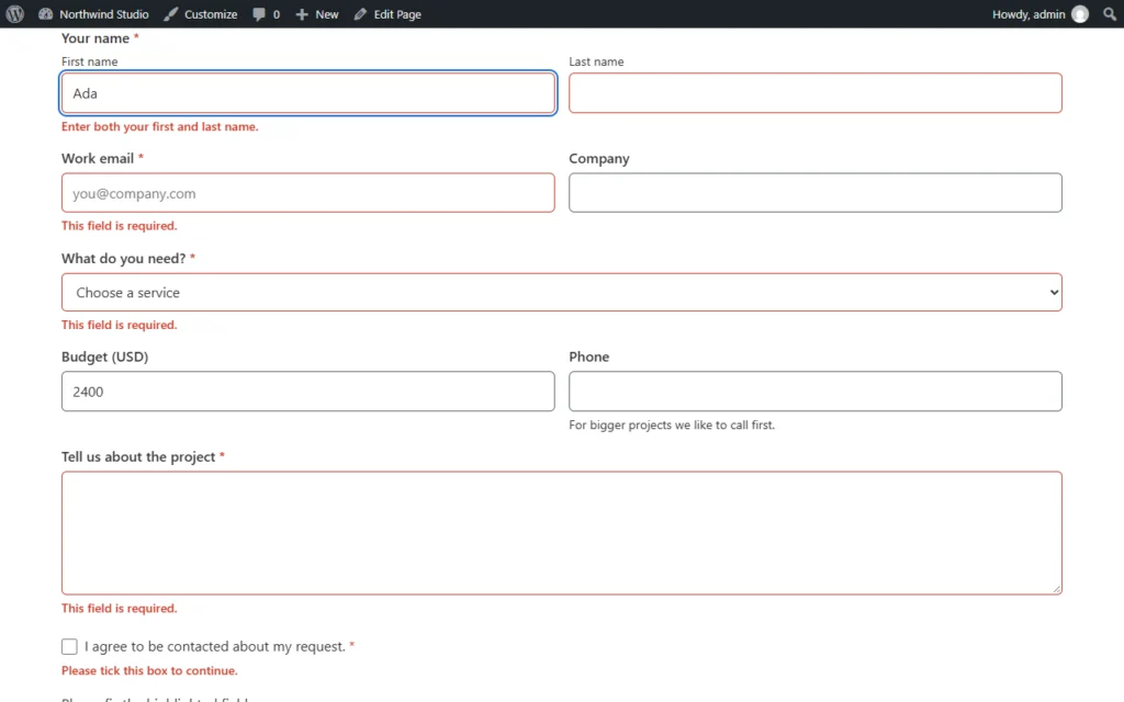
An error must say what is wrong and how to fix it, appear next to the field, and be connected to it in the code. “Enter an email address like [email protected]” helps; a red border alone does not.
6. Announce errors and success
When the form is sent and something is wrong, or it succeeds, screen reader users must be told. FillKite announces errors and the success message through a live region, so assistive technology reads them without the visitor hunting for them.
7. Work with a keyboard alone
Every field, choice, button and link must be reachable and usable with Tab, Shift+Tab, Space, Enter and the arrow keys, in a logical order. Custom widgets such as sliders and ratings need the same care.
8. Keep focus visible
Keyboard users must always see where they are. Never remove the focus outline without replacing it with something equally clear. FillKite forms show a visible focus outline on every control.
9. Use enough contrast
WCAG 2.1 AA asks for a contrast ratio of at least 4.5:1 for normal text and 3:1 for field borders and other controls. FillKite’s default colours meet AA, and its form styler warns you when your own colours are hard to read.
10. Never rely on colour alone
An error shown only in red, or a selected option shown only by colour, is invisible to many people. Add text, icons or shape changes as well.
11. Give enough time
Forms that expire, time out or rush people exclude those who type slowly or use assistive technology. Avoid time limits, or warn and allow more time.
12. Respect motion and language settings
Animations should stop when someone asks their device to reduce motion, and forms should work in right-to-left languages where needed. FillKite supports both.
Accessible forms, field by field
| Field | What to get right |
|---|---|
| Name and address | Separate labelled parts, and autocomplete hints so browsers can fill them |
| Email and phone | The right input type, so phones show the right keyboard |
| Date | A format hint, and a way to type the date, not only a calendar |
| Radio buttons and checkboxes | A group with a legend, and large tap targets |
| Dropdown | A real select element, or a custom one with full keyboard support |
| Rating and scales | Keyboard operable, with each option named for screen readers |
| File upload | A real button to browse, not drag and drop only |
| Consent | The full consent text as the label, with links that make sense out of context |
Accessible forms get these details right quietly. Visitors who do not need them never notice; visitors who do can finish without help.
Write accessible form copy
Words are part of accessibility. Plain language helps people with cognitive differences, people reading in a second language and anyone in a hurry:
- use short labels that say exactly what to enter, such as “Work email”;
- put format help before the field, not only in the error: “Date, for example 14/03/2027”;
- write errors that explain the fix, not just the fault;
- make link text meaningful, such as “privacy policy”, not “click here”;
- name the button after the result, such as “Send my question”.
Let the builder catch problems
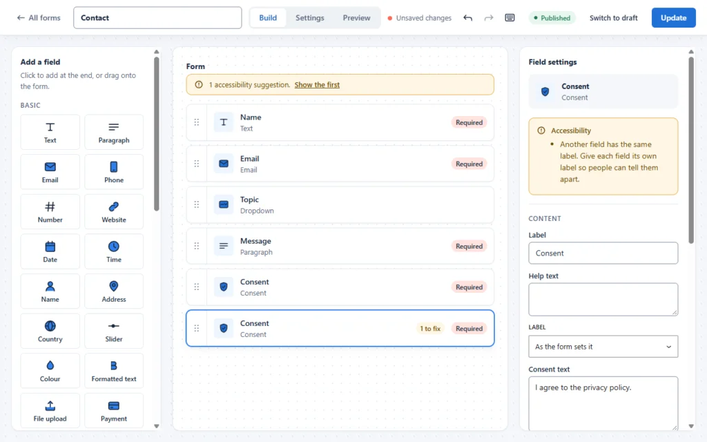
Rules are easier to follow when a tool checks them for you. While you build, FillKite checks each field for common problems: missing labels, placeholders used as labels, two fields with the same label, unclear format messages and low-contrast text. The form shows how many suggestions there are, each field shows what to fix, and the form tells you when it passes all checks.
Questions people ask about accessibility
Is this only about blind visitors? No. Accessible forms help people with many kinds of disability, permanent or temporary: a broken arm, a migraine, tired eyes at the end of a long day. They also help older visitors and anyone on a small screen.
Does it make forms look worse? It should not. Strong contrast, clear labels and visible focus can look modern and clean. Good design and accessibility usually pull in the same direction; problems come from shortcuts, not from style.
Is it expensive? Building accessible forms from the start costs little extra, especially with a form tool that handles the code for you. Fixing inaccessible forms later, after a complaint, costs far more.
Test your accessible forms in 10 minutes
- Keyboard only. Put the mouse aside. Tab through the form, fill in every field, trigger an error, fix it and send. Could you do everything? Could you always see where you were?
- Zoom to 200%. Does the form still fit, without text overlapping or fields cut off?
- Screen reader. Turn on VoiceOver on a Mac or iPhone, or NVDA on Windows. Listen to each field: is the label read, and is “required” announced?
- Errors. Leave a required field empty and send. Is the error clear, next to the field, and announced?
- Contrast. Check label, input text and border colours with a contrast checker, especially on coloured backgrounds.
Automated tools help too. The axe accessibility engine, used in browser extensions, finds many code-level problems in seconds. FillKite’s own admin screens were checked with axe, with no violations found.
Accessible forms with several steps
Long forms split into steps need extra care: tell people how many steps there are and which one they are on, give each step a clear title, let them go back without losing answers, and move focus sensibly when a new step appears. FillKite Pro’s multi-step forms show the step count and titles and check each step before moving on. Our guide to the WordPress multi step form covers the design side.
Accessible forms in page builders
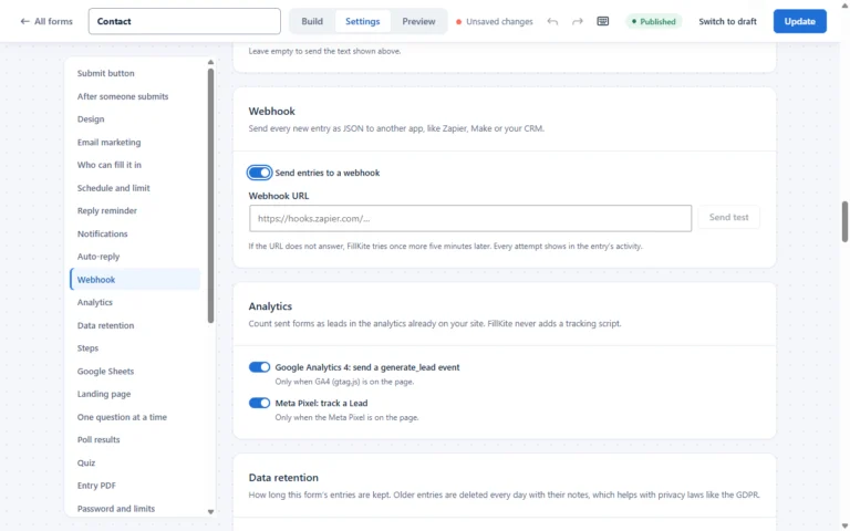
Page builders make it easy to change colours and spacing, and just as easy to break contrast. When you place a form in Elementor or another builder, check the label and input text colours against the section background, and keep the focus outline visible. FillKite’s Elementor widget applies your label colour to every label, including checkbox and consent labels, so a dark section does not hide some of them. See our guide to the Elementor contact form.
Touch and mobile
On phones, accessible forms need large tap targets, enough space between choices, and fields that do not jump when the keyboard opens. Labels above fields stay visible while typing, which matters more on small screens. Test on a real phone, with the text size turned up in the phone’s settings, to see what many visitors see.
Help browsers fill in details
Browsers and password managers can fill in names, email addresses, phone numbers and addresses. For people with motor or memory difficulties, that can turn a hard task into a single tap. It works when fields use the right types and autocomplete hints. Use proper name, email, phone and address fields rather than generic text boxes, and test that your browser offers to fill them.
Make it a team habit
Accessibility slips when it depends on one careful person. Add a short check to your routine for every new form: keyboard through it once, trigger one error, and glance at contrast on the real page. Designers should check colour choices before handing them over, and whoever writes copy should keep labels and errors plain. When everyone knows the basics, accessible forms become the normal way you build, not a special project.
Keep a note of the problems you find and fix, too. Patterns appear quickly, such as the same low-contrast colour used in several places, and fixing the pattern once helps every form at the same time.
Design traps to avoid
- Light grey text on white for labels or hints looks elegant and fails contrast.
- Floating labels that shrink into the field border can become tiny and low contrast.
- Custom checkboxes built from images often lose keyboard and screen reader support.
- Dark sections where the form keeps dark text become unreadable. Set label and input colours for the background.
- Captcha puzzles are a barrier for many disabled users. Invisible spam protection avoids them; see our guide to WordPress form spam.
After the form is sent
Accessibility does not end at the Send button. The success message must be announced and easy to find, a redirect to a thank-you page should land on a clear heading, and confirmation emails should be readable by screen readers: real text rather than images of text, a logical heading order and meaningful link text. If you use an auto-reply, keep it short and plain; our auto reply email template examples follow that pattern.
The business case
Accessible forms are fairer, and they also pay. Every person who can finish your form is a potential customer; every one who cannot is lost without a trace, because they never reach your inbox to complain. Many of the fixes also raise completion for everyone: clear labels, helpful errors and good contrast reduce mistakes and abandonment across the board. Our guide to form abandonment shows how the same fixes lift conversions.
What the law says
Accessibility is increasingly a legal requirement, not only good practice. The European Accessibility Act applies to many products and services sold to consumers in the EU, and other countries have their own rules. Most of them point to WCAG 2.1 at level AA as the technical standard. Accessible forms are one of the areas most often checked, because forms are where people complete tasks.
Publish an accessibility statement
An accessibility statement tells visitors what standard you aim for, what you know is not perfect yet, and how to contact you if something gets in their way. It shows good faith and gives people a route other than giving up. Include a way to reach you that does not depend on the form itself, such as an email address and phone number, so someone blocked by a form can still get in touch.
An accessible forms checklist
- Every field has a real, visible label.
- Required fields are marked in text and in code.
- Choices are grouped under their question.
- Errors are in words, next to the field, and announced.
- The whole form works with a keyboard, with visible focus.
- Text and borders meet contrast minimums on every background.
- No meaning relies on colour alone.
- No time limits, and motion respects reduced-motion settings.
- The form is tested with a keyboard, zoom and a screen reader.
Where accessible forms go wrong
| Problem | Who it affects | Fix |
|---|---|---|
| No label, placeholder only | Screen reader users, everyone who forgets | A real label above the field |
| Error only in red | Colour blind and screen reader users | Error text next to the field |
| Focus outline removed | Keyboard users | A clear focus style |
| Low contrast text | Low vision, sunlight on phones | At least 4.5:1 |
| Puzzle captcha | Many disabled users | Invisible spam protection |
| Form times out | Slow typists, assistive technology users | No time limit |
Frequently asked questions
What makes a form accessible?
Real labels, clear errors in words, full keyboard support, visible focus, enough contrast, no colour-only meaning and no time pressure. Accessible forms follow WCAG 2.1 AA.
Are placeholders bad for accessibility?
Only when they replace labels. As an example inside a field with a proper label, a placeholder is fine, as long as it has enough contrast.
How do I test my forms for accessibility?
Use a keyboard only, zoom to 200%, try a screen reader, trigger errors and check contrast. Add an automated checker such as axe for code-level issues.
How often should I recheck my forms?
Whenever you add fields, change colours or move a form to a new page design, and at least once a year. Accessible forms can break quietly when a theme or builder update changes styles.
Do hidden labels count?
Yes, when they are hidden only visually and still present for assistive technology. Accessible forms can hide a label on screen for design reasons, as long as screen readers still read it.
Does FillKite make my forms accessible automatically?
It handles labels, error announcements, keyboard support, focus and default contrast, and checks your forms as you build. Your choices, such as colours and wording, still matter.
Build accessible forms by default. FillKite gives every field a real label, announces errors, supports keyboards and checks each form for accessibility problems while you build. Read our accessibility statement, see every feature, or install FillKite free from WordPress.org.