WordPress Multi Step Form: Build One in 6 Simple Steps
In short:
- A WordPress multi step form splits one long form into short steps, with Back and Next buttons and a progress indicator.
- It suits forms with more than about eight fields: quotes, applications, bookings and onboarding. Short contact forms are better as one step.
- The rules that make it work: an easy first step, related questions grouped together, a visible progress indicator, and checks on each step before moving on.
- Conditional logic and steps work together: a step whose fields are all hidden is skipped and not counted.
- In FillKite, multi-step forms are part of FillKite Pro: add a Page break field wherever a new step should start. Gravity Forms includes multi-page forms on every paid plan; our Gravity Forms alternative page compares the prices side by side.
A WordPress multi step form takes a long, intimidating form and turns it into a short sequence of easy screens. Instead of facing fifteen fields at once, the visitor answers three or four questions, presses Next, and answers a few more.
This guide explains when a WordPress multi step form helps and when it hurts, how to build one in six simple steps, how to design the steps so people finish, and the mistakes that make visitors give up halfway. The examples use FillKite Pro, where each step starts with a Page break field.
What is a WordPress multi step form?
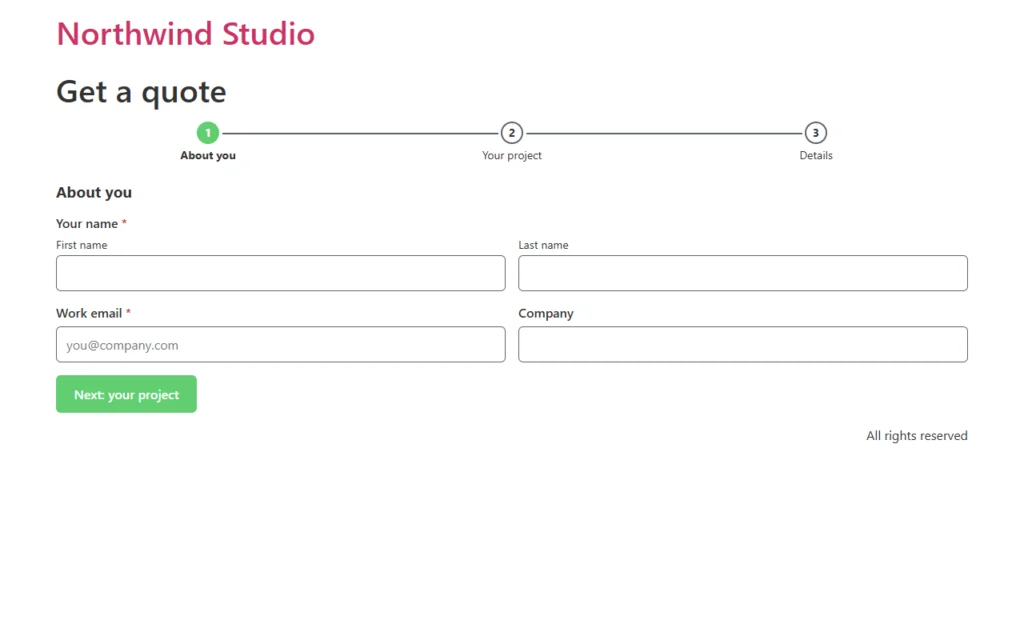
A WordPress multi step form is a single form shown one part at a time. Each part, or step, has its own title and a few fields. The visitor moves forward with a Next button and back with a Back button, and a progress indicator shows how far they are through.
Behind the scenes it is still one form with one submission. Nothing is sent until the last step, and the entry arrives in your inbox with every answer together, exactly like a normal form.
When a WordPress multi step form helps
Steps are not automatically better. They add clicks, and a four-field contact form split into two steps is simply slower. The value appears once a form gets long enough to look like work.
| Form | Fields | Multi-step? |
|---|---|---|
| Contact form | 3 to 5 | No, keep it on one screen |
| Newsletter sign-up | 1 to 2 | No |
| Quote or project enquiry | 8 to 15 | Yes, usually 2 to 3 steps |
| Job application | 10 to 20 | Yes, 3 to 4 steps |
| Booking or registration | 8 to 15 | Yes, grouped by topic |
| Client onboarding | 15 or more | Yes, 4 to 6 steps |
A good rule of thumb: if the form needs scrolling on a phone before the visitor reaches the button, a WordPress multi step form is worth trying.
Why steps help people finish
Three things happen when a long form is split well:
- It looks easy. The first screen shows three questions, not fifteen. People start forms that look short.
- It builds commitment. Once someone has answered the first step, they are more likely to finish than to throw that effort away.
- It keeps attention. Grouping related questions together, such as everything about the project on one step, makes each question easier to answer.
The effect depends on good step design. A WordPress multi step form with a demanding first step, or no sense of how long is left, loses people just as fast as a long single page.
How to build a WordPress multi step form in 6 simple steps
1. List your questions and group them
Write every field the form needs, then group them by topic. For a quote form, that might be “About you” (name, email, company), “Your project” (service, budget, timeline) and “Details” (message, files, consent). Aim for two to five fields per step.
2. Build the form as normal
In FillKite, create the form with all its fields in order, just as you would a single-page form. Mark required fields and set up conditional logic as usual.
3. Add a Page break where each step starts
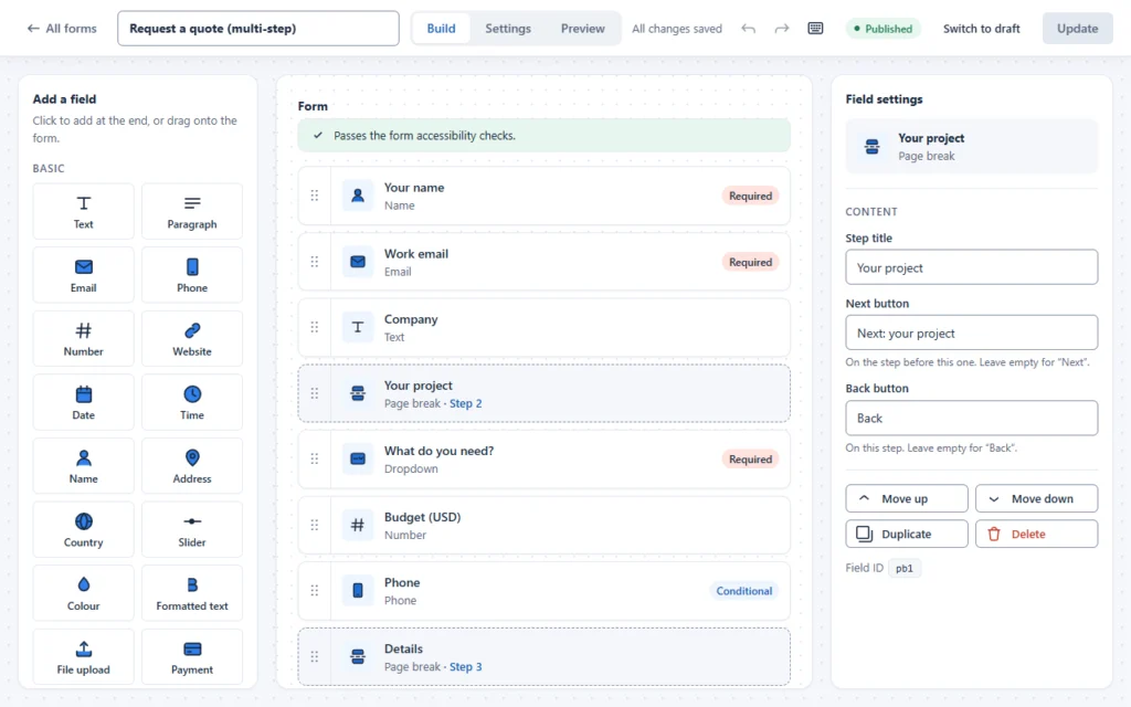
With FillKite Pro active, add a Page break field above the first question of each new step. Everything between two page breaks becomes one step. The builder labels each page break with its step number, so you can see the structure at a glance.
4. Name each step and its buttons
Click a page break to set its Step title, the label of the Next button that leads to it, and the label of its Back button. “Next: your project” tells people what is coming, which is friendlier than a plain “Next”. The first step’s title is set in the form’s Steps settings.
5. Choose how progress is shown
In the form’s Settings tab, the Steps section lets you show numbered steps with titles, a simple progress bar, or no progress at all. Numbered steps with titles work best for three to five steps; a progress bar suits longer forms.
6. Test every path
Open the Preview tab and go through the form as a visitor: forward, back, and with different answers. Then send a real entry and check that every answer arrived in the inbox.
Design rules that keep people going
- Make the first step the easiest. Ask for a name and email first, or a simple choice such as the service they need. Never open with the hardest question.
- Keep steps even. Three short steps and one very long one feels like a trick. Balance the fields.
- Always show progress. People are more patient when they know how much is left.
- Check each step before moving on. Errors should appear on the step where they happened, not at the very end. FillKite checks each step’s required fields before it lets the visitor continue.
- Let people go back without losing what they typed.
- Put consent and the message last, right before the Send button, where they make sense.
Three WordPress multi step form examples
Here is how three common forms split into steps. Use them as a starting point and adjust to your questions.
Quote request (3 steps)
- About you: name, work email, company.
- Your project: service, budget, timeline, and a phone number if the budget is large.
- Details: project description, how they heard about you, consent.
Job application (4 steps)
- Contact: name, email, phone.
- The role: position, location, earliest start date.
- Experience: years of experience, portfolio link, CV upload.
- About you: cover note, salary expectation, consent.
Client onboarding (5 steps)
- Company: business name, website, main contact.
- Goals: what they want to achieve and by when.
- Access: which accounts and tools you will need.
- Brand: logo, colours, examples they like.
- Billing: invoice address and contact.
Notice the pattern: every WordPress multi step form above opens with easy, factual questions and leaves open-ended ones for later, when the visitor is already committed.
Make every step accessible
Moving between steps changes the page without a reload, which can confuse screen reader users if it is not handled well. The W3C’s guidance on multi-page forms recommends a few basics: tell people how many steps there are and which one they are on, give each step a clear title, and let them go back and review.
FillKite’s multi-step forms show the step count and titles, label the progress list for assistive technology, keep Back and Next as real buttons that work with a keyboard, and show errors next to the fields on the current step. Keep your step titles meaningful, such as “Your project” rather than “Step 2”, and the WordPress multi step form stays easy for everyone.
Conditional logic in a WordPress multi step form
Steps and logic work well together. You can show a step’s fields only for some visitors, for example a “Hosting details” step only when the visitor says they already have a website.
FillKite handles the awkward case for you: a step whose fields are all hidden by logic is skipped, and is not counted in the progress. The visitor never lands on an empty step, and “Step 2 of 3” stays true. Our guide to WordPress conditional logic covers the rules in detail.
Single page vs a WordPress multi step form
An honest comparison helps you choose, because each layout wins in different places:
| Single page | Multi-step | |
|---|---|---|
| Looks short at first glance | Only when it really is short | Yes, always |
| Clicks to finish | One | One per step |
| Easy to review all answers | Yes, on one screen | Needs Back to review |
| Works for long forms on phones | Lots of scrolling | Yes, one short screen at a time |
| Groups related questions | With headings | Naturally, one topic per step |
| Setup effort | Lowest | A few extra minutes |
In short: a single page for short forms, a WordPress multi step form for long ones. If you are unsure, build the long version as steps and compare its conversion rate with the old single page for a few weeks.
Write copy for each step
The words around the fields matter as much as the fields. Every step in a WordPress multi step form is a small screen with one job, so give it a title that says what the step is about, and, where it helps, one short line of explanation, such as “This helps us give you an accurate price.”
Button labels carry the flow. “Next: your project” and “Next: details” tell people exactly where they are going. On the last step, the Send button should describe the result, such as “Send my request”, not “Submit”.
Steps or one question at a time?
A WordPress multi step form groups a few questions per screen. A conversational form goes further and shows a single question per screen, like a chat. FillKite Pro offers both: page breaks for steps, and a One question at a time mode in the form settings.
Use steps for business forms where related questions belong together, such as a quote with a budget, timeline and service. Use one question at a time for surveys, quizzes and friendly sign-ups where each answer is quick and the experience matters as much as the data.
Multi-step forms for internal use
Steps are not only for customers. Many teams use a WordPress multi step form for internal processes: a new client checklist, an equipment request, a project brief. The same rules apply, and the benefit is often bigger, because internal forms tend to be long.
For internal forms, restrict access so only logged-in users can fill them in, send the notification to the person who acts on it, and use the inbox statuses to track what has been done. FillKite’s form rules can open a form only to logged-in users, so an internal brief never appears to the public even if someone finds the page.
Mobile first
Most visitors will fill in your WordPress multi step form on a phone, which is exactly where steps help most. A few mobile details matter:
- keep each step short enough to fit on a phone screen with the keyboard open;
- use full-width fields on small screens;
- make the Next button large and easy to tap;
- use the right field types, such as email and phone, so phones show the right keyboard.
FillKite fields that share a row on a desktop stack automatically on narrow screens, so a step designed on a laptop still works on a phone.
Where a WordPress multi step form goes wrong
| Mistake | What happens | Do this instead |
|---|---|---|
| Splitting a short form | More clicks for no benefit | Keep forms under about eight fields on one page |
| Hard first step | People leave before they start | Start with the easiest questions |
| No progress indicator | Visitors fear an endless form | Show steps or a progress bar |
| Errors only at the end | People must go back through every step | Check each step before Next |
| Empty steps from logic | A blank screen and a wrong count | Skip steps whose fields are all hidden |
| Too many steps | Fatigue sets in | Three to five steps is usually enough |
| Vague buttons | People do not know what comes next | Name the next step on the button |
Spam and multi-step forms
Some people add steps hoping they will stop spam. They do not: bots submit the whole form in one request and never see your steps. A WordPress multi step form needs the same protection as any other form. FillKite applies its honeypot, time check and spam score to every form, with or without steps. See our guide to stopping WordPress form spam for the full set of layers.
Measure whether it works
After you switch to a WordPress multi step form, compare its results with the old version. FillKite’s forms list shows each form’s views and conversion rate over the last 30 days, so you can see whether more visitors finish. Give it a few weeks of normal traffic before you judge, and change one thing at a time: the number of steps, the order, or the first question.
Look at the entries too, not only the numbers. If the answers on later steps are thin or rushed, those steps may be asking for too much. A shorter, sharper WordPress multi step form often brings in better leads as well as more of them, because each question clearly earns its place.
If conversions drop, the first step is usually the problem. Make it shorter or easier, and test again.
After the last step
The final step deserves as much care as the first. Make the Send button say what happens, such as “Send my request”, and show a clear message or a thank-you page afterwards. Send an auto-reply so the visitor knows their answers arrived, and make sure the notification reaches you: a long form is a serious enquiry. If notifications are unreliable on your site, see our guide to fixing a form not sending email.
A long, detailed enquiry also deserves a fast reply. The person has invested real time in your form. Our guide to lead response time shows how to make sure it gets one.
Frequently asked questions
Is a WordPress multi step form better than a single page?
For long forms, usually yes. For short ones, no. The benefit comes from making a long form feel manageable, so it matters most above about eight fields.
Is the multi-step form free in FillKite?
Multi-step forms are part of FillKite Pro, which adds the Page break field. The free plugin includes 29 field types, conditional logic, the inbox and spam protection.
Are answers saved between steps?
The visitor can move back and forward without losing what they typed. The entry is created when they press Send on the last step.
How many steps should a form have?
Three to five is right for most forms. Fewer than three rarely justifies the extra clicks, and more than six starts to feel long however well it is designed.
What happens if someone leaves halfway?
Nothing is sent until the last step, so a visitor who leaves early does not create an entry. That is why an easy first step and a clear progress indicator matter so much.
Can I add file uploads to a step?
Yes. With FillKite Pro, a File upload field can sit on any step, such as a CV on the experience step of a job application. The files are uploaded when the form is sent.
Can I use a WordPress multi step form in Elementor?
Yes. Build it in FillKite and place it with the FillKite Form widget, the block or the shortcode. The steps work the same everywhere.
Turn long forms into short steps. FillKite Pro adds the Page break field for multi-step forms, with numbered steps or a progress bar and checks on every step. See the field types, compare FillKite Pro, or install FillKite free from WordPress.org.