Form Conversion Rate: 11 Ways to Increase Form Conversions
In short:
- Form conversion rate is the share of people who see a form and send it: entries divided by views, as a percentage.
- There is no universal “good” number. Compare each form with its own past, and with similar forms on your own site.
- The biggest wins usually come from fewer fields, a clearer first question, a better button, and trust signals next to the form.
- Measure before and after every change, one change at a time, over at least a few weeks of normal traffic.
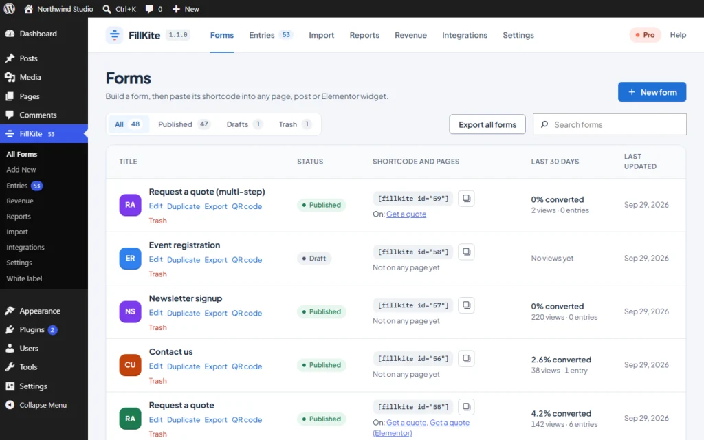
- FillKite shows each form’s views, entries and conversion rate for the last 30 days, without cookies.
Form conversion rate tells you how well a form turns interest into enquiries. Two forms can get the same traffic and bring in very different numbers of leads, and the difference is almost always in the form itself: its length, its questions, its button and what surrounds it.
This guide explains how to measure form conversion rate, what affects it, and eleven proven ways to raise it. None of them needs a redesign. The examples use FillKite, which shows the numbers on every form.
What is form conversion rate?
Form conversion rate is the percentage of people who see a form and then submit it:
form conversion rate = entries ÷ views × 100If a quote form is shown 400 times in a month and receives 12 entries, its form conversion rate is 3%. The number is simple, but the two parts need care:
- Views should count times the form was actually displayed, not visits to the whole site.
- Entries should exclude spam, or bots will make a weak form look strong.
FillKite counts a view each time a form is shown and keeps only daily totals, with no visitor data, and spam entries sit in their own folder so they do not inflate the count. The forms list shows the result for the last 30 days next to each form.
What is a good form conversion rate?
Published averages vary so widely by industry, traffic source and form type that they are not much use for your site. A newsletter box in a footer and a quote form on a pricing page are different jobs. A better approach:
- Compare a form with itself over time. Is this month better than last?
- Compare similar forms on your site. If one service page converts at twice the rate of another, look at what is different.
- Compare traffic sources. Visitors from an ad that promised a price will behave differently from people reading a blog post.
Form conversion rate by type of form
Different forms ask different amounts of commitment, so expect their rates to differ too. Rather than chase an industry number, understand where each of your forms sits:
| Form | Commitment asked | What to expect |
|---|---|---|
| Newsletter sign-up | Very low: one email address | Low rate on busy pages, because most visitors came for something else |
| Download or discount form | Low: an email for something useful now | Higher, if the offer is clear |
| Contact form | Medium: a written message | Depends heavily on the page and intent |
| Quote request | Higher: project details | Lower rate, but each entry is worth more |
| Application or onboarding | High: many details | Lowest rate, visitors are already committed |
This is why a single site-wide form conversion rate is misleading. Look at each form separately, in its own context.
What affects form conversion rate
| Factor | Effect |
|---|---|
| Number of fields | Every extra field is a reason to stop |
| Hard or personal questions | Phone numbers and budgets put some people off |
| Where the form sits | Forms near the decision point convert better |
| What the page promised | A mismatch between the offer and the form loses people |
| Trust | People hesitate to give details to an unknown site |
| Errors and friction | Unclear errors and captchas make people give up |
| Speed and mobile layout | Slow or cramped forms lose phone visitors |
Each of the eleven fixes below works on one of these factors.
1. Remove every field you do not use
Go through the form and ask of each field: what do we do with this answer? If the honest answer is “nothing” or “we could ask later”, remove it. Fewer fields is the most reliable way to raise form conversion rate, because every question has a cost.
Common candidates: a separate “Subject” field, “How did you hear about us?” (tracking can answer that), a second address line, and a phone number when you always reply by email.
2. Ask follow-up questions only when they apply
Some questions are needed for some visitors only. Conditional logic shows them only when an earlier answer makes them relevant, so everyone else sees a shorter form. For example, show “Order number” only when the topic is Support. Our guide to WordPress conditional logic explains how.
3. Make the first question easy
People commit once they start. Open with something easy, such as a name or a simple choice, not the hardest question. For long forms, splitting into steps with an easy first step often raises form conversion rate further; see our guide to the WordPress multi step form.
4. Write a better button
“Submit” says nothing about what happens next. A button that describes the result, such as “Get my quote”, “Send my question” or “Book a call”, reminds people why they are filling in the form. Make it large, high-contrast and easy to tap on a phone.
5. Add trust next to the form
Right beside the form is where hesitation happens. A few lines help:
- when and how you will reply (“We reply within two working hours”);
- what you will do with their details, with a link to your privacy policy;
- a short testimonial or a recognisable client logo;
- a real email address or phone number, for people who prefer not to use forms.
6. Use clear labels, not placeholders
Labels above fields stay visible while people type, which the W3C’s form tutorials recommend for everyone. Placeholder text inside a field disappears on the first keystroke, so people forget what the field was for. Clear labels reduce errors, and fewer errors mean a higher form conversion rate.
7. Show helpful errors, in the right place
An error should appear next to the field that caused it, say what is wrong in plain words, and keep everything else the visitor typed. “Please enter an email address like [email protected]” beats “Invalid input”. FillKite shows errors inline and announces them to screen readers.
8. Drop the captcha if you can
Captchas stop bots and some real people. Invisible protection, such as a honeypot, a time check and a spam score, stops most spam with no cost to visitors. Add a captcha only if spam still gets through. Our guide to WordPress form spam shows the layers.
9. Put the form where the decision happens
A form on a separate contact page that visitors must find converts worse than a form placed right where they decide: after the pricing table, at the end of a service description, beside a case study. Put a short form, or a button that opens it in a popup, at those points.
10. Match the form to the promise
If an ad says “Free quote in 24 hours” and the form asks for twelve details with no mention of the quote, visitors feel misled. Repeat the promise in the form heading, and ask only what you need to keep it. This is one of the quickest ways to raise form conversion rate on paid traffic.
11. Keep it fast and mobile-friendly
Most visitors fill in forms on phones. Use the right field types so phones show the right keyboard, keep fields full width on small screens, and avoid heavy scripts. FillKite loads about 11 KB per form and nothing on pages without one, and its fields stack automatically on narrow screens.
Write a heading that sells the next step
Most forms sit under a generic heading such as “Contact us”. A heading that says what the visitor gets is more persuasive: “Get a fixed quote within one working day”, “Ask us anything, a real person replies”, “Book a free 20-minute call”.
Add one short line under it that removes the biggest worry. For a quote form, that might be “No obligation, and we never share your details.” For a booking form, “Pick any time, you can change it later.” These small words often move form conversion rate more than design changes, because they speak to the reason people hesitate.
A worked example
Here is how the fixes combine, using an illustrative quote form for a small agency. The starting point: eleven fields, a “Submit” button, and a heading that said “Contact”.
- Removed four fields nobody used: subject, fax, second address line, and “How did you hear about us?”, which tracking now answers.
- Moved the budget and phone fields behind conditional logic, shown only for larger projects.
- Changed the button to “Get my quote”.
- Rewrote the heading to “Get a fixed quote within one working day”, with a reply-time promise below.
- Moved the form from a separate contact page to the end of each service page.
Each change was made on its own and measured for a few weeks before the next. The point is not the exact figures, which will differ on your site, but the method: small, measured changes, each one kept only if the form conversion rate improved and lead quality held.
A five-minute phone audit
Before changing anything, fill in your own form on a phone, on mobile data, as if you were a customer. Most problems become obvious within a minute:
- Does the page load quickly enough that you do not wait to start?
- Can you see the first field without scrolling past a large banner?
- Does each field bring up the right keyboard, numbers for a phone number, @ for an email?
- Is any field so small you have to zoom in to tap it?
- If you leave a required field empty, is the error clear and next to the field?
- After sending, do you know what happens next?
Write down every moment of friction. Fixing them is usually quick, and it helps the many visitors who never tell you they gave up.
Accessible forms convert better
Accessibility and conversions point in the same direction. Real labels, visible focus, strong contrast, errors in words rather than colour alone, and forms that work with a keyboard help people using assistive technology, and they also help everyone filling in a form on a small screen in bright sunlight.
FillKite builds these into every form and checks each one while you build, flagging missing labels, placeholders used as labels and low-contrast text. Treat those warnings as conversion fixes, not just compliance.
How to test changes to form conversion rate
- Write down the current numbers: views, entries and form conversion rate for the last 30 days.
- Change one thing, such as removing two fields or rewording the button.
- Wait for enough traffic, usually a few weeks and at least a few hundred views.
- Compare, and keep the change only if the rate improved.
- Check lead quality too. More entries of worse quality is not always a win.
Changing several things at once makes it impossible to know which one worked. Patience here pays off: one proven improvement a month adds up quickly.
Conversion rate and lead quality
Raising form conversion rate is only half the goal. If you remove every qualifying question, you may get more entries but fewer good ones. FillKite gives each entry a Lead quality badge, High, Medium or Low, so you can check that a higher rate still brings in the leads you want. If quality drops sharply after a change, you may have removed a question that was doing useful filtering.
Where this goes wrong
| Mistake | Why it misleads | Do this instead |
|---|---|---|
| Counting page visits as views | The rate looks lower than it is | Count form views |
| Counting spam as entries | A weak form looks strong | Keep spam out of the count |
| Judging after a few days | Random noise looks like a result | Wait for weeks of traffic |
| Changing everything at once | You cannot tell what worked | One change at a time |
| Chasing rate alone | More entries, fewer good leads | Watch lead quality too |
| Ignoring slow replies | Converted leads go cold anyway | Reply quickly to every entry |
That last row matters. A higher form conversion rate only pays off if the extra leads are answered quickly. Our guide to lead response time covers the other half of the job.
Do not forget what happens after Send
The moment after someone submits is part of the experience. A clear confirmation, a thank-you page that explains the next step, and an auto-reply that confirms the message arrived all reduce the chance that the visitor fills in a competitor’s form “just in case”. They do not change your form conversion rate directly, but they protect the value of every conversion you get.
Know where converting visitors come from
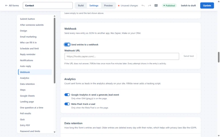
A form’s overall rate can hide big differences between traffic sources. FillKite saves the UTM tags, referrer and landing page with each entry, without cookies, so you can see which campaigns and pages bring in enquiries. If you run Google Analytics 4 or the Meta Pixel, each form can also send a lead event, so your analytics count real submissions.
How to increase form conversions: the short answer
If you only have ten minutes, do these five things in this order. They are the changes that most often move the number, and each one is explained in the sections above.
- Cut the form down to the fields you will really use.
- Make the first question easy, such as a name, not a long free-text box.
- Replace “Submit” with a button that says what happens next, such as “Send my request”.
- Put one line of trust next to the button: how fast you reply, and that you will not share the details.
- Test it on a phone and fix anything that makes you pinch, scroll sideways or retype.
Then change one thing at a time and compare the results over a few weeks, so you know which change worked.
Frequently asked questions
How do I increase form conversions?
Remove every field you do not use, make the first question easy, write a button that says what happens next, add a line of trust next to the button, and make sure the form works well on a phone. Change one thing at a time and compare entries divided by views before and after.
How do I calculate form conversion rate?
Divide the number of entries by the number of times the form was viewed, then multiply by 100. Use form views, not page visits, and leave spam out of the entries.
Why is my form conversion rate low?
The most common causes are too many fields, a hard first question, a vague button, a mismatch between the page’s promise and the form, and friction such as captchas or unclear errors.
Does a multi-step form have a higher conversion rate?
Often, for long forms. Splitting a long form into short steps with an easy first step usually helps. For short forms, one step is better.
How long should I test a change?
Until the form has had enough views for the difference to be meaningful, usually a few weeks and a few hundred views. Low-traffic forms need longer. Avoid judging on a single good or bad week.
Do more fields always lower conversions?
Not always. A question that helps visitors, such as choosing the service they need, can make a form feel more relevant. The fields that hurt are the ones that feel pointless or intrusive. Remove those first.
Can a thank-you page affect my numbers?
Not the rate itself, but it helps you measure it. A dedicated thank-you page gives analytics tools a clear conversion to count, which is useful when you compare campaigns.
Should every form have the same design?
Consistent styling helps trust, but the content should fit the job. A newsletter form needs one field and a clear promise; a quote form needs the right questions. Measure each separately.
Where can I see form conversion rate in WordPress?
FillKite shows views, entries and conversion rate for each form in its forms list, for the last 30 days, without cookies or visitor tracking.
See the form conversion rate of every form. FillKite counts views without cookies, keeps spam out of your numbers, and helps you raise conversions with logic, steps and clean design. See every feature, read about lead tracking, or install FillKite free from WordPress.org.
Last updated: