What Is a Popup Form? Types, Examples and When to Use One
In short:
- A popup form is a form that opens in a layer on top of the page, usually after a trigger such as a click, instead of sitting in the page itself.
- It can appear when a visitor clicks a button, after a delay, after scrolling, when the cursor leaves the page, or as a slide-in. The click is the least intrusive trigger.
- Popup forms suit short forms with one goal: a newsletter sign-up, a quote request, a booking, a download. Long forms belong on their own page.
- Popups get a bad name when they interrupt people. A popup form that opens because the visitor asked for it is welcome; one that blocks the page is not.
- In WordPress you can add one with a shortcode, a block or an Elementor widget. FillKite opens its popups from a button and needs no popup plugin.
You have probably seen one today: you click “Get a quote” or “Subscribe”, the page dims, and a small form appears in the middle of the screen. So what is a popup form, exactly, and when is it the right choice? This guide gives a plain answer, shows how a popup form is built, compares it with a form on the page, and explains the types, the good and bad uses, and the rules that keep one accessible and fast.
If you already know what you want and need the setup steps, jump to the section on how to add one in WordPress, or read our longer guide to the WordPress popup form.
What is a popup form?
A popup form is a web form that appears in a layer above the current page, usually with the page dimmed behind it. The visitor fills it in without leaving the page, and the layer closes when the form is sent or dismissed. Designers also call it a modal form or a lightbox form. Some people write “pop-up form” with a hyphen; it is the same thing.
A popup form is not the same as a pop-up window. A pop-up window is a separate browser window, which most browsers block. A popup form lives inside the page you are already on, so nothing is blocked and nothing new opens in the taskbar.
The idea is simple and it works for one reason: the visitor stays where they were. They do not lose their place in an article, a product list or a pricing table, and a short form is one step away.
How a popup form works
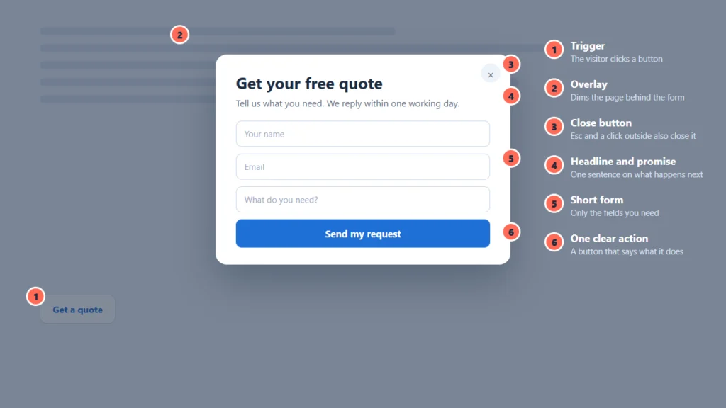
Every popup form has the same few parts, shown in the picture at the top of this page. A trigger starts it. An overlay dims the page behind. A close button lets the visitor leave. Inside sit a headline and a promise, a short form, and one clear action.
The behaviour matters as much as the look. A well-built popup form opens from a real button that works with a keyboard, moves focus into the form when it opens, keeps focus inside while it is open, and closes with the Esc key, the close button or a click outside. When it closes, focus returns to the button that opened it. The W3C describes this pattern in its guide to the modal dialog pattern.
Popup form or inline form?
An inline form sits in the page, like the contact form on a contact page. A popup form is hidden until something opens it. Neither is better in general; they suit different jobs.
| Question | Popup form | Inline form |
|---|---|---|
| Where does it live? | In a layer above the page | In the page itself |
| Does the visitor leave the page? | No | No |
| Best for | Short forms with one goal | Long forms and main-purpose pages |
| Takes room on the page? | Only a button | The whole form |
| Can people refer to the page while filling it in? | No, it covers the page | Yes |
| Easy to link to? | Only through the page that holds it | Yes, it has its own address |
A useful rule: if the form is the reason for the page, make it inline. If the form is one of several things the page offers, a popup form keeps the page clean.
Types of popup forms
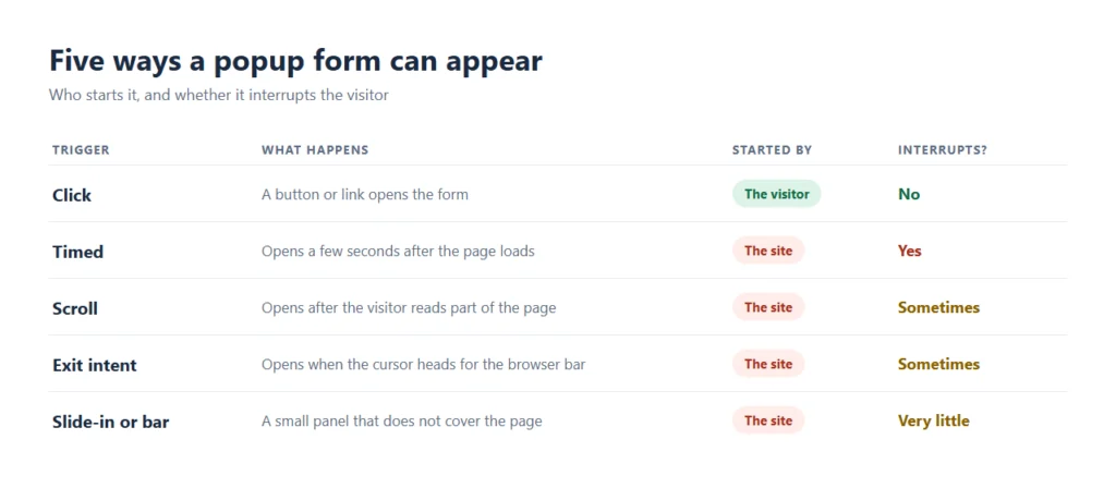
What is a popup form without a trigger? Just a hidden form. The trigger decides how the visitor feels about it, so it is the choice that matters most. There are five common ones.
Click-to-open
A button or link opens the form. The visitor asks for it, so it never interrupts. This is the best default for quotes, bookings and contact forms.
Timed
The form opens a few seconds after the page loads. Visitors have not had time to read anything, so it often feels like an interruption.
Scroll-triggered
The form opens after the visitor has scrolled part of the way down. It at least waits until they have shown interest.
Exit intent
The form opens when the cursor moves toward the browser bar. It cannot work on phones, where there is no cursor, so it is a desktop-only idea.
Slide-in or bar
A small panel slides in at a corner, or a bar sits at the top or bottom. It does not cover the page, so it interrupts the least of the site-started kinds.
FillKite’s popups are click-to-open. If you need timed, scroll or exit triggers, you can put a FillKite form inside a popup tool, and FillKite still handles the form, the entries and the emails.
What is a popup form used for?
The best uses share one trait: the visitor has a clear, small thing to do. These are the most common, with live demos you can try. Nothing you type in a demo is saved or sent.
- Newsletter sign-up. Name, email, and a promise of what they will get. See the newsletter sign-up demos.
- Quote request. A “Get a quote” button on a service page, with three or four fields. Try the quote request demo.
- Booking or appointment. A date, a time and contact details. Try the appointment request demo.
- Lead magnet. A guide or checklist in exchange for an email address. Try the free guide demo, which shows a download button after sending.
- Contact. A short message form that opens from the header or footer on every page. See the contact form demo.
- Feedback. A rating and a comment opened from a link at the end of an order or article.
Are popup forms good or bad?
Before you add one, it helps to know what a popup form is good at and where it fails.
Both, depending on how they are used. The honest list:
What a popup form does well
- It keeps visitors on the page, so they do not lose their place.
- It saves room: the page shows a button instead of a whole form.
- It puts the form exactly where the visitor is ready to act.
- One form can be reused from many places, such as a button in the header on every page.
Where a popup form goes wrong
- It interrupts when it opens by itself, which is why many visitors dislike popups.
- It is harder to use on small screens if the form is long.
- It cannot be linked to directly, shared or bookmarked.
- If it is built carelessly, it traps keyboard and screen reader users.
Most of the bad reputation comes from the second kind of use: popups that open uninvited. A popup form the visitor asks for does not have that problem.
Are popup forms bad for SEO?
Not by themselves. Google’s guidance is about intrusive interstitials: popups that get in the way of the content people came for, especially on phones after a search. You can read it in Google’s advice on avoiding intrusive interstitials. The safe approach follows from it: prefer popups the visitor opens, and do not cover the content with a popup the moment someone arrives.
When should you use a popup form?
Use a popup form when:
- the form is short, with about three to five fields;
- the visitor can act without referring back to the page;
- the same form is useful from many pages;
- you want a clean page with a clear button.
Avoid it when the form is long, such as a job application or a detailed brief, when the form is the main purpose of the page, or when people often arrive from a link that should take them straight to the form. A long form can be split into steps; our guide to the multi-step form explains how.
How to add a popup form in WordPress
Once you know what a popup form is, adding one is quick. In WordPress the question is usually where the button goes and how the form opens.
There are three simple ways in FillKite, and none needs a separate popup plugin.
- Shortcode. Add a popup attribute with the button text:
. The page shows a button, and clicking it opens the form. - Block. In the block editor, add the FillKite Form block, choose your form, and fill in Open in a popup with the button text.
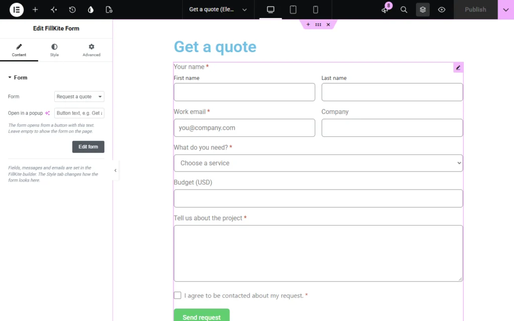
- Elementor. The FillKite Form widget has the same Open in a popup field in its Content tab.
The full guide to the WordPress popup form covers six ways, including a sticky header button and using a page builder’s popup tool. The popups guide in the docs has the settings in detail.
Three popup form examples, field by field
Seeing a popup form built makes the idea concrete. These three examples show the headline, the fields and the button, and why each choice works.
A quote request on a service page
Button on the page: “Get a quote”. Headline in the popup: “Get your free quote”. Promise: “We reply within one working day.” Fields: name, email and “What do you need?” as a dropdown. Button: “Send my request”. Three fields are enough to start a conversation, and the promise sets an expectation that you can keep.
A newsletter sign-up on a blog
Button or link: “Get the monthly guide”. Headline: “One useful email a month”. Fields: first name and email. Button: “Subscribe”. A consent line sits under the fields. The ask is small, and the headline says how often the visitor will hear from you, which is the first thing most people wonder.
A booking request on a local business site
Button in the header: “Book a visit”. Headline: “Pick a day that suits you”. Fields: name, phone, preferred date and a note. Button: “Request this day”. Because the button sits in the header, the same popup form is available on every page, so a visitor can book from wherever they are reading.
How do you know if a popup form works?
Count what the form brings in, not how many times it opens. Three numbers tell you most of it: how many people open the popup, how many send it, and what share of those become real leads or customers. If many open it and few send it, the form is probably too long or the promise unclear. If few open it, the button is hard to find or says too little. Our guide to form conversion rate explains how to measure and improve each step.
Popup form best practices
- One goal. A popup form should do one thing. If you need two, use two buttons.
- Few fields. Ask only for what you will use. Every extra field lowers the number of people who finish; see our guide to form abandonment.
- A clear promise. Say what happens next: “We reply within one working day.”
- A button that says what it does. “Send my request” beats “Submit”.
- Easy to close. A visible close button, the Esc key and a click outside should all work.
- Accessible. Labels on every field, errors that are announced, and focus that moves into and out of the popup. More in our guide to accessible forms.
- A useful ending. Show a thank-you message, a download or a next step instead of just closing; see what happens after someone sends the form.
- Consent where needed. If you collect personal data, include your consent line inside the popup, not only on the page.
Common popup form mistakes
| Mistake | What goes wrong | Fix |
|---|---|---|
| Opening the moment the page loads | Visitors close it before reading anything | Open it from a button |
| A long form in a popup | Hard to use on a phone | Use a page, or split into steps |
| No visible close button | Visitors feel trapped | Add a close button, and support Esc |
| Hiding the labels | Screen readers cannot name the fields | Keep real labels |
| Several popups on one page | The page feels pushy | One goal per page |
| Not testing on a phone | The form is cut off or hard to tap | Test on a real phone |
Frequently asked questions
What is a popup form?
A popup form is a form that appears in a layer above the page, usually after a trigger such as a click. The visitor fills it in without leaving the page, and it closes when the form is sent or dismissed.
What is the difference between a popup form and a pop-up window?
A pop-up window is a separate browser window, which most browsers block. A popup form is part of the page you are on, so it is not blocked and the visitor never leaves.
What is the difference between a popup form and an inline form?
An inline form sits in the page. A popup form is hidden until a trigger opens it. Use inline for long forms and main-purpose pages, and a popup form for short forms with one goal.
Are popup forms bad for SEO?
Not by themselves. Google’s concern is intrusive interstitials that cover the content people came for. A popup form that opens only when the visitor clicks a button is the visitor’s own choice.
Do popup forms work on mobile?
Yes, if the form is short and the popup fits the screen. Long forms are better on their own page. Exit-intent triggers do not work on phones, because there is no cursor.
Are popup forms accessible?
They can be. A good one opens from a real button, moves focus into the popup, keeps it there, closes with Esc or a close button, and returns focus to the button. FillKite’s popups follow these rules.
How do I add a popup form in WordPress?
In FillKite, add a popup attribute to the shortcode, fill in Open in a popup in the block, or use the Open in a popup field in the Elementor widget. The page shows a button, and the form opens when it is clicked.
Add a popup form without a popup plugin. FillKite opens any form in a popup from a button, with a keyboard-friendly, accessible dialog, and saves every entry. Read the popups guide, browse the live demo forms, or see all features. The free plugin is on WordPress.org.